

The colors of this image tell a story from the bottom to the top of a coastal sunset. Cooler tones of the Pacific ocean gradually lead into the soft warm sunset creating a nice tension balancing out itself like yin and yang.
When going out to shoot images as a landscape photographer there are a lot of things to take into consideration. Composition, light, and textures are all important, but today I would like to take a moment to consider color in images and how it plays its own theme.
Color theory when implemented properly can become a beautiful part of photography. It can work in a couple different ways to affect mood and the story telling elements of a photo. The two themes that are most common in proper implementation of color theory are complimentary and simplified.
In a complimentary color theme there are going to be some contrasting colors on the opposite sides of the color wheel. This way, the color in the image balances out nicely. The balancing of complimentary colors can happen in a mixing throughout the frame or it can balance out two sides like a yin and yang.

I commonly try to balance out the tones of a warm sunset with something cooler in the foreground like a water element. This creates a tension between the two halves of the photo balancing out somewhere in the middle where the emotions mix of the different colors. The other option of mixing tones works well with things like purple flowers in a sea of green foliage like I have done with my shot of Mt. Rainier during sunset.
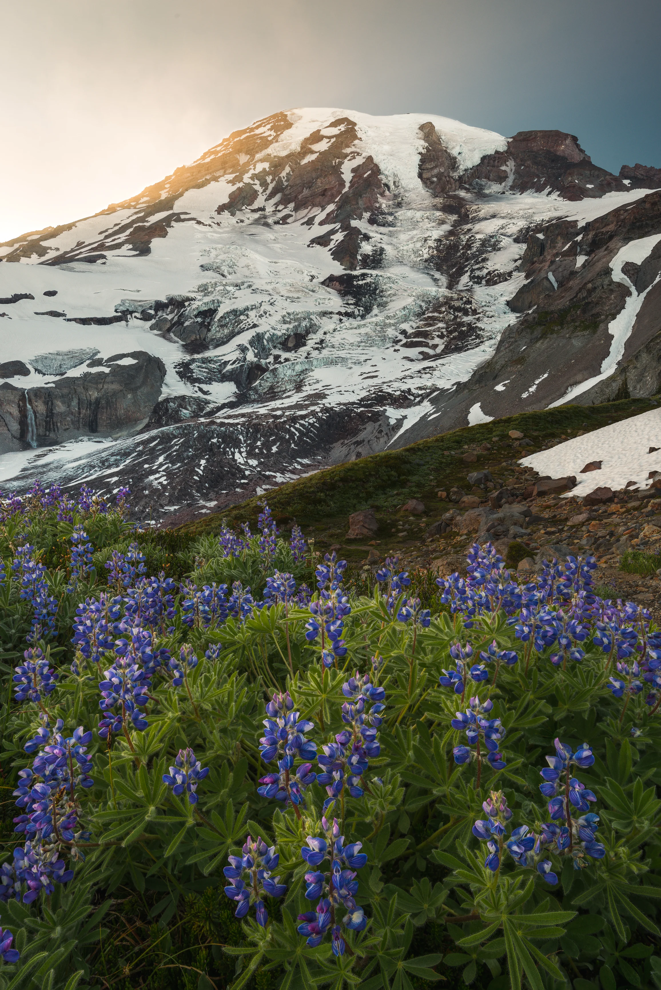
The purple flowers with green foliage and cool snow with a warm sunset.
“Color provokes a psychic vibration. Color hides a power still unknown but real, which acts on every part of the human body.”
“In an atmosphere of uniform density the most distant things seen through it, such as the mountains, in consequence of the great quantity of atmosphere which is between your eye and them, will appear blue. Therefore you should make the building… wall which is more distant less defined and bluer… five times as far away, make five times as blue.”
In contrast to complimentary colors appearing in frame there is also the option of keeping things more simple and remove distractions. Having all the tones being of the same family you can keep the mood of the image consistent telling a different story entirely with colors. This is where you can really play in post-production to keep it as consistent as possible controlling the mood like a note played from a violin. Which is to say carefully and with pin-point accuracy communicating a complete story using the psychology of colors.


In this image, I uses the green tones to create a consistent mood throughout the frame. An exciting spring scene filled with new and old growth together deep in the woods.
Warmer tones create excitement and optimism as the lines of the image keep consistent with the scene growing more intense as they lead the eye deeper in frame from the edges.
Colors affect you and how you feel. While complimentary colors balance each other and create tension a simplified color theme emphasizes a consistent mood. So, lets talk briefly about some of the moods created by different colors and how they can play into a story made by a photo.

Some colors create a lot more energy and are exciting. In this family of colors there are red, yellow and orange. Red is going to help to communicate passion, love, and excitement in its most brilliant state. Yellow has more of an energy to it and warmth. Orange is going to have enthusiasm and spontaneous feelings related to it. All of these colors can make one feel more anxious when viewing them especially together. If an image sticks to this theme it will create a feeling of lots of energy which works well for people that want to have that extra motivation when viewing the art.

Blue and green are two similar colors that work well on their own and together even though they are not complimentary. Both colors can create a feeling of calmness and nature. They are the two most common colors in nature and what people relate to being of earth. Blue tends to lean more on the somber side though as a cooler temperature and the tone most commonly linked to winter. Green can be more exciting color filled with the optimism of spring.
Purple is one of my favorite colors and not just because it is connected to that of royalty. It is soothing and mysterious at the same time. It is also not a color that occurs with much frequency in nature making it that much more special.
Whatever you choose to go shoot in landscape photography it is important to keep in mind how the colors affect the image. Making sense of the landscape and what the colors are telling you can help create dynamic fiery scenes and soothing cool compositions that are well thought out from the composition to texture to the colors in frame, and when looking at other’s art you can appreciate the attention to color details as well how they work together to create something absolutely stunning!

One more example of a complimentary color combination using green and purple.

The tones in the trees contrast the deep purple sky nicely here.