
If you need to get the most out of your next headshot then check out this article I wrote. Learn how to get the best headshot for your professional profile!
Read MoreHow To Get The Best Headshot.
in portraits
style

If you need to get the most out of your next headshot then check out this article I wrote. Learn how to get the best headshot for your professional profile!
Read MoreI have edited thousands of different types of photos now to get different looks and styles. There are many things that change from one person to the next as far as style goes and how they may want the image to look, but there are certain things that should always be avoided. To be honest, this is going to be more about what NOT to do when editing photos. If you want to keep a specific style without destroying images and looking back later on shaking your head at what you have done keep reading!
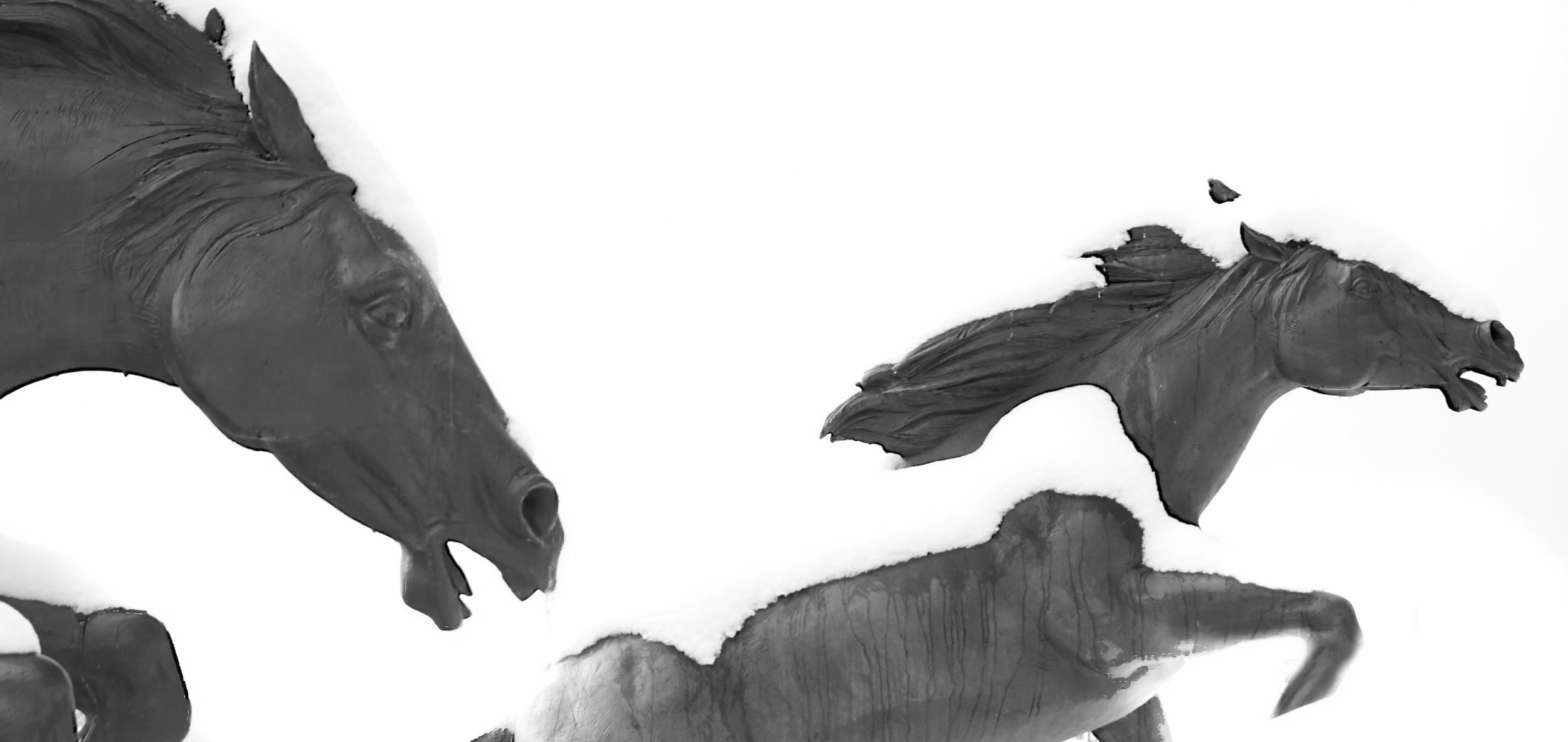
The white snow is clipping through to complete white in this photo.
This is an easy one to not understand at first but let me help explain it. Clipping is when parts of your image are completely black or completely white. Sometimes this is unavoidable or a desired effect like when things actually are fully white or black, but that is usually not the case in most photos. It deals with adding or having too much contrast in a scene and it can look very bad like when you make someone's skin white by over-brightening. It looks unnatural and should be avoided by bringing down the highlights or bringing up the shadows. For more advanced editing it will involve setting the white/black points to be right where there is only a little bit of pure black and white in the image.
This is not referring to any photos of dinosaur bones or archeologists, but it is referring to that sharpening slider you may have been abusing. The sharpening slider is one of the most powerful and dangerous effects to utilize, and it should be used sparingly. It is designed to emphasize detail and lines to increase the clarity of an image, but doing too much can cause a drastic increase in image noise as well as weird and abnormal artifacts around straight lines, fine details, and plain colors. It makes the photo look crunchy and of a much lower quality than it should be.

This was shot at a fairly high ISO for micro 4/3 of 2000 and being careful with noise reduction allowed me to keep the detail in the photo.
There are ways of selectively decreasing the digital noise of a high ISO image, but maybe you decided it was too much work to select out these areas and just cancelled out noise across the entire photo. Well you just lost every little fine bit of detail that you could have had and turned it into a giant blurry mess just like someone spilling water on a piece of notebook paper with fresh ink writing on it. Digital noise is a tricky thing to get rid of sometimes, but remember that it still has some detail in it that you won't want to loose!
Applying Filters to images is not only cheesy, but it is lowering the quality of your image. A filter will cut down on the sharpness, dynamic range, and uniqueness of your photos. They also have effects that are way over the top with replicating some kind of look like old scratched and sun-faded film. The old film look can be replicated without these filters in apps through editing the photo to exactly how you want it with color casts, de-saturating, matting, etc. Just take the time to perfect your own look instead of instantly applying a cheap filter.

This shot of a house sparrow has a brick building behind it and the blur created behind the subject by the lens is a natural blur.
The fake blurring of a photo does serve a purpose of cutting out distractions and drawing in a person's focus to what you want them to see, but it is too often they are used when they shouldn't or being overused with too much blur. There are actual lenses that exist for doing these effects without software and they are really cool for isolating a subject or making a toy world look in a big city. They are expensive though and they take a fair amount of skill to use well enough to consistently get a quality effect. That is where these software effects come in and they are nice for replicating the lenses on the cheap. Use them to get to an effect while avoiding making it obvious is what I would suggest because you don't get much control over what is and is not selected to blur. Remember less is more with these tools and you should be fine!
Just don't...
This is going to be affecting the punch of the mid-tones of the image as well as some of the sharpness. I like this slider quite a bit and when used properly it can bring a dull image back to life almost on its own. The problem is that there is a fine line where, when crossed, this will make the photo look overly grungy and gritty. My suggestion is to go to where you like the photo with the slider and then pull back by 30-40%.
Vignettes happen naturally when a lens doesn't properly transmit light evenly across the entire frame. It is common on wide-angle lenses and on lenses with thick filters in front of them. They can have a nice effect when they are very light to draw you into the center of the frame. i tend to get rid of them, but there are reasons to be a fan of the light vignette. The vignettes that are not acceptable are the ones that are so dark or bright (yes there is such a thing as a white vignette) that the corners of the photo are completely gone.

Avoiding over-saturating images like this one can be difficult as it is supposed to be colorful.
Not meant in a good way and in more of the sense that I want to pop my eyes out because of the vomiting of saturation that happens to a photo. I am talking about over saturating the colors of a photo till they start to bleed into each other, turn neon, and make the photo look like it came from a horrible 90's animated movie (look back and you'll see what I'm talking about here). There is such a thing as control when it comes to the saturation slider and you should exercise that from now on unless you like the look of things like "Rock-A-Doodle".
There is artistic and there is changing the white balance to make people look like blue martians or turning everything white into an ugly and unnatural orange. At least try to make the image look natural and realistic! Go ahead and emphasize a sunset or make an environment look cold or warm. Just don't go overboard with this one as your camera is usually going to be just about right.

With the night sky you can go for anything from a blueish sky to a black sky for a creative white balance because both are realistic to see.